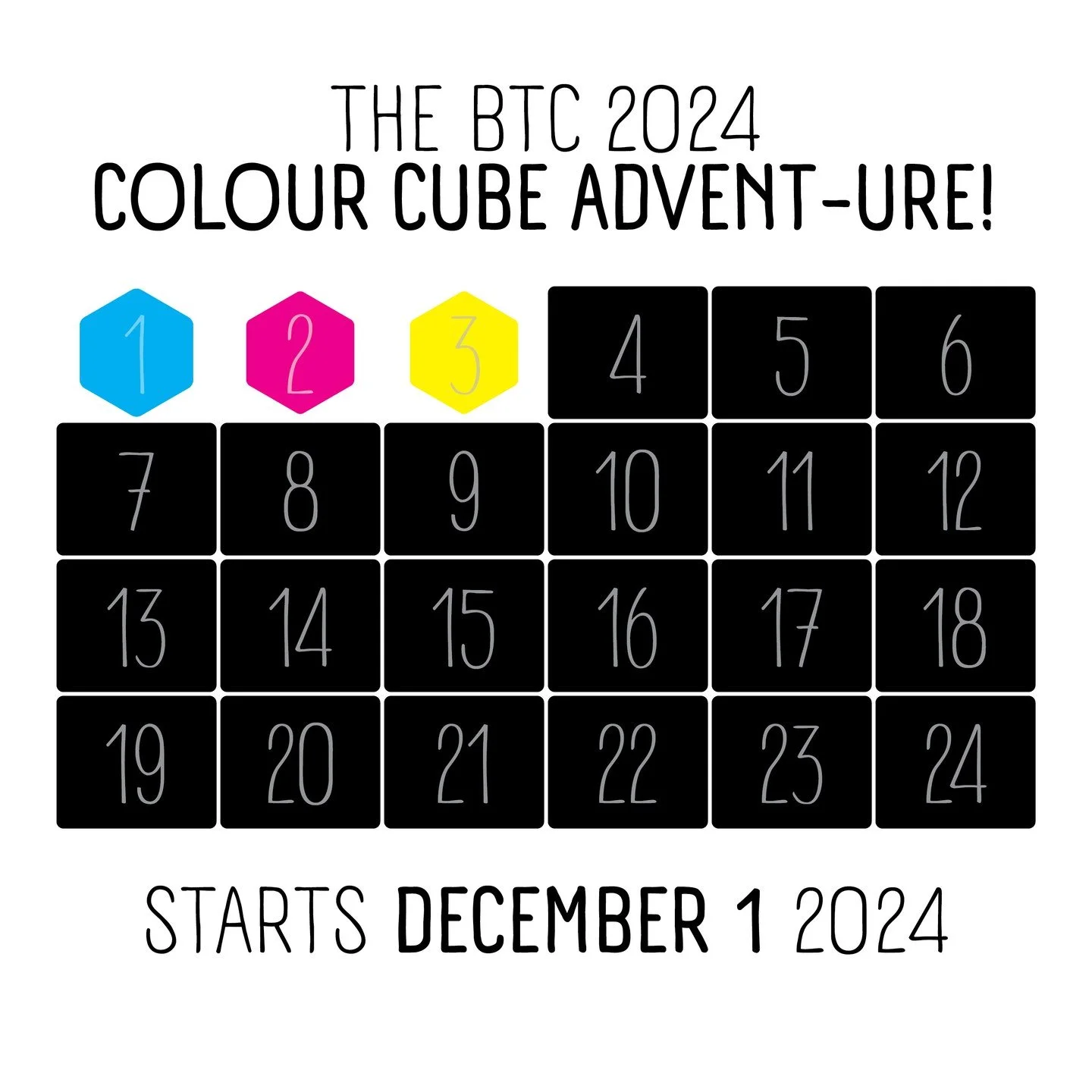
READY TO UP YOUR COLOUR GAME?
THE GAME STARTS HERE…
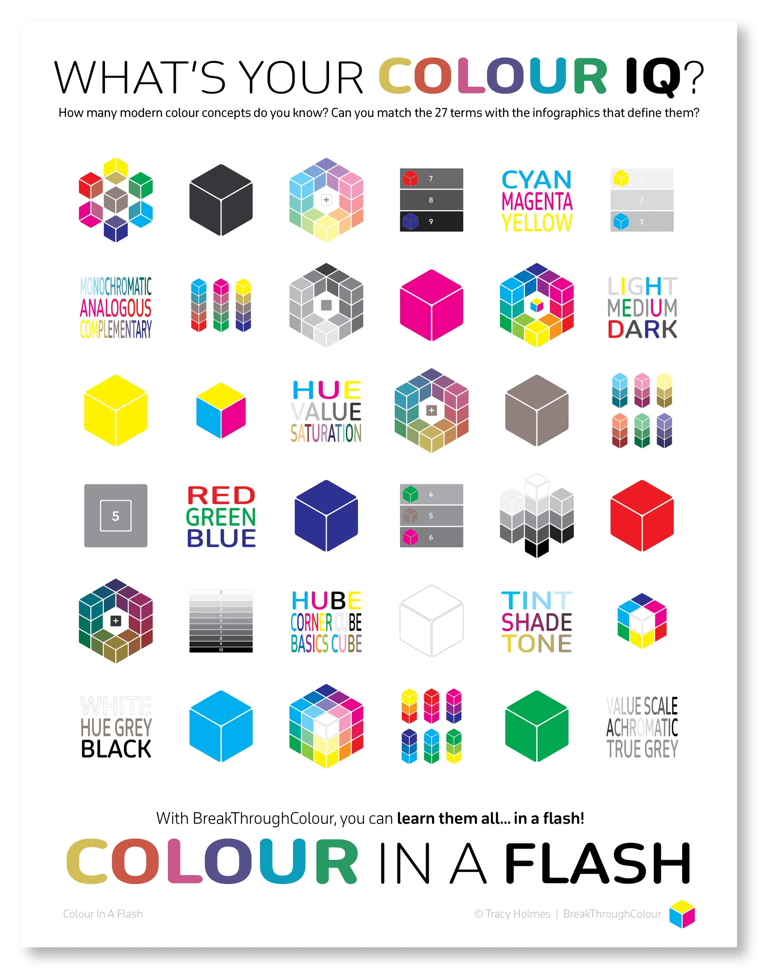
WHAT’S YOUR
COLOUR IQ?
Complete the form below for instant access to this free colour-full PDF printable.
How many modern colour concepts do you know?
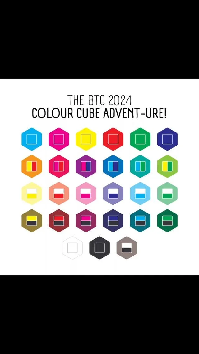
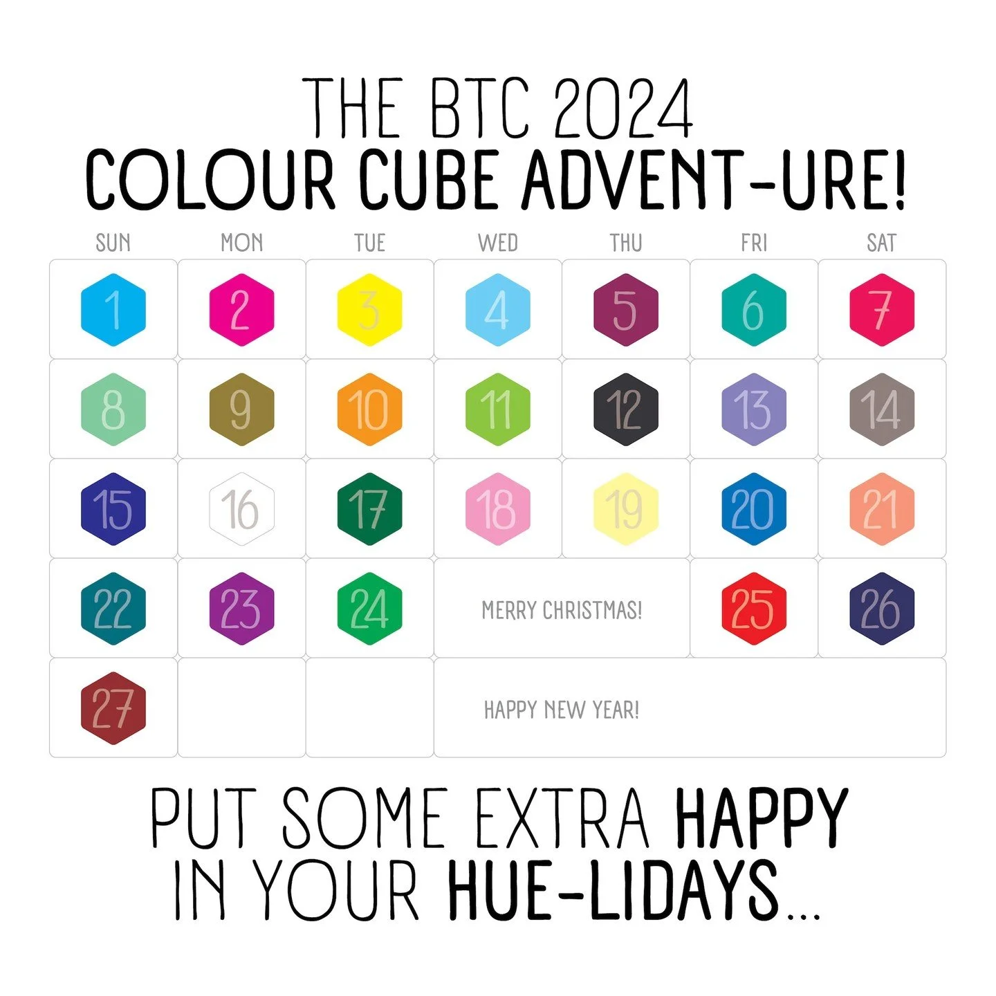
This free PDF printable features 27 infographics and 9 triad sets of the colour terms that name them, all on one colour-full page.
As a personal pin-up for inspiration in your studio, as a reference in your workspace, or to add some colour to your classroom, complete this form and get instant access to this ‘Flash-y’ colour resource.
Your personal colour practice starts here . . .
Ready for some truth about colour?
YOUR COLOUR WHEEL IS LYING…
Do Red and Blue make Purple? Not really…
Is Pink a Shade of Red? No, and no.
Are Red, Yellow, and Blue primary colours? No, yes, and no. But as a trio? Definitely not.
It did the job a few centuries ago. But the traditional RYB colour wheel no longer works in a modern world, no matter what your medium.
Is there a better way to work and play with colour?
Yes, Yes… YES!
Colour theory isn’t new. We’ve been spinning a colour wheel for hundreds of years.
But a lot has changed in what we know, what we have, and how we use it.
So why are we still relying on an ‘old school’ system?
With a few new rules and some cool new tools, we can all share a common language to better explore, understand, and celebrate colour together.
GOOD THINGS COME IN THREES
When it comes to understanding colour, I always say, every breakthrough starts with ‘The Power of 3.’
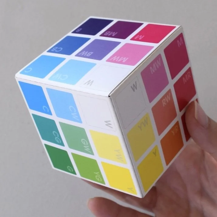
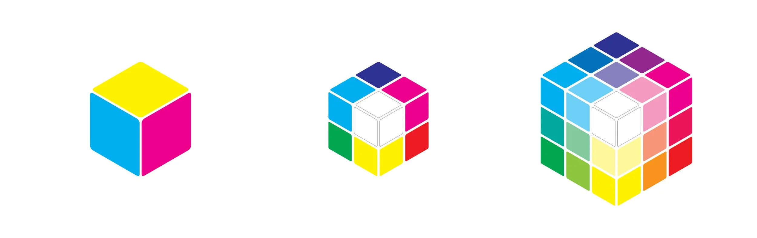
The BreakThroughColour system is an interactive collection of Colour Cards and Cubes based on a 3-dimensional colour space, one dimension for each of the three primary colours: Cyan, Magenta, and Yellow.
The idea of colour in 3D can be a bit of a paradigm shift, especially if you were schooled with an ‘old school’ colour wheel. But why spin a wheel when you can explore the power of colour, cubed?
BTC Colour Cards and Cubes are best explored using modern colour concepts that give every colour journey a strong start and keep us on track as we go. Some you may know, some you may think you know, and some may be waiting to be discovered as part of your colour breakthrough experience.
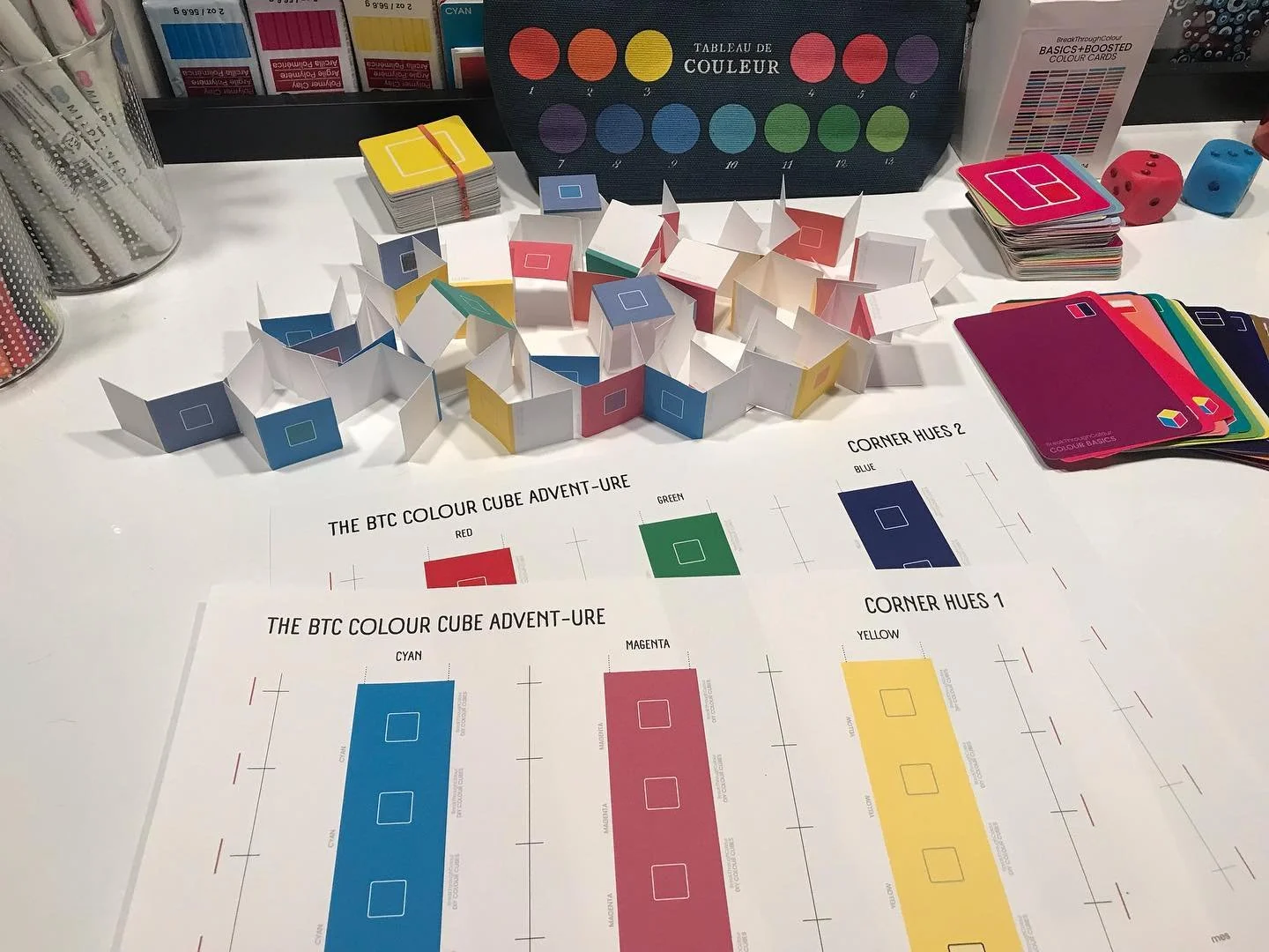
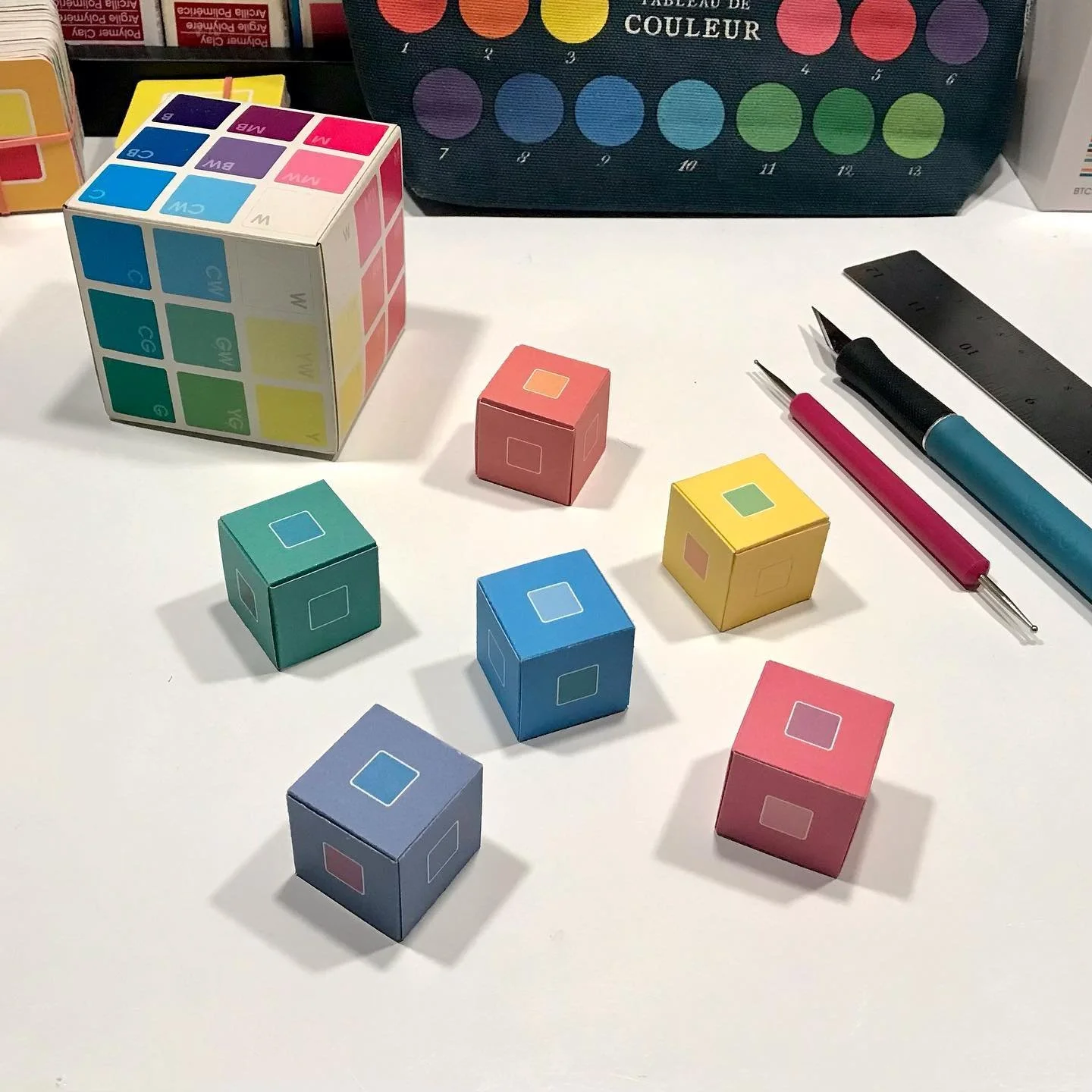
Colour In A Flash is a comprehensive resource that combines a DIY deck of 36 DIY Flash Cards with a companion Field Guide, defining all the key colours, concepts, and cubes that are fundamental for a modern colour practice.
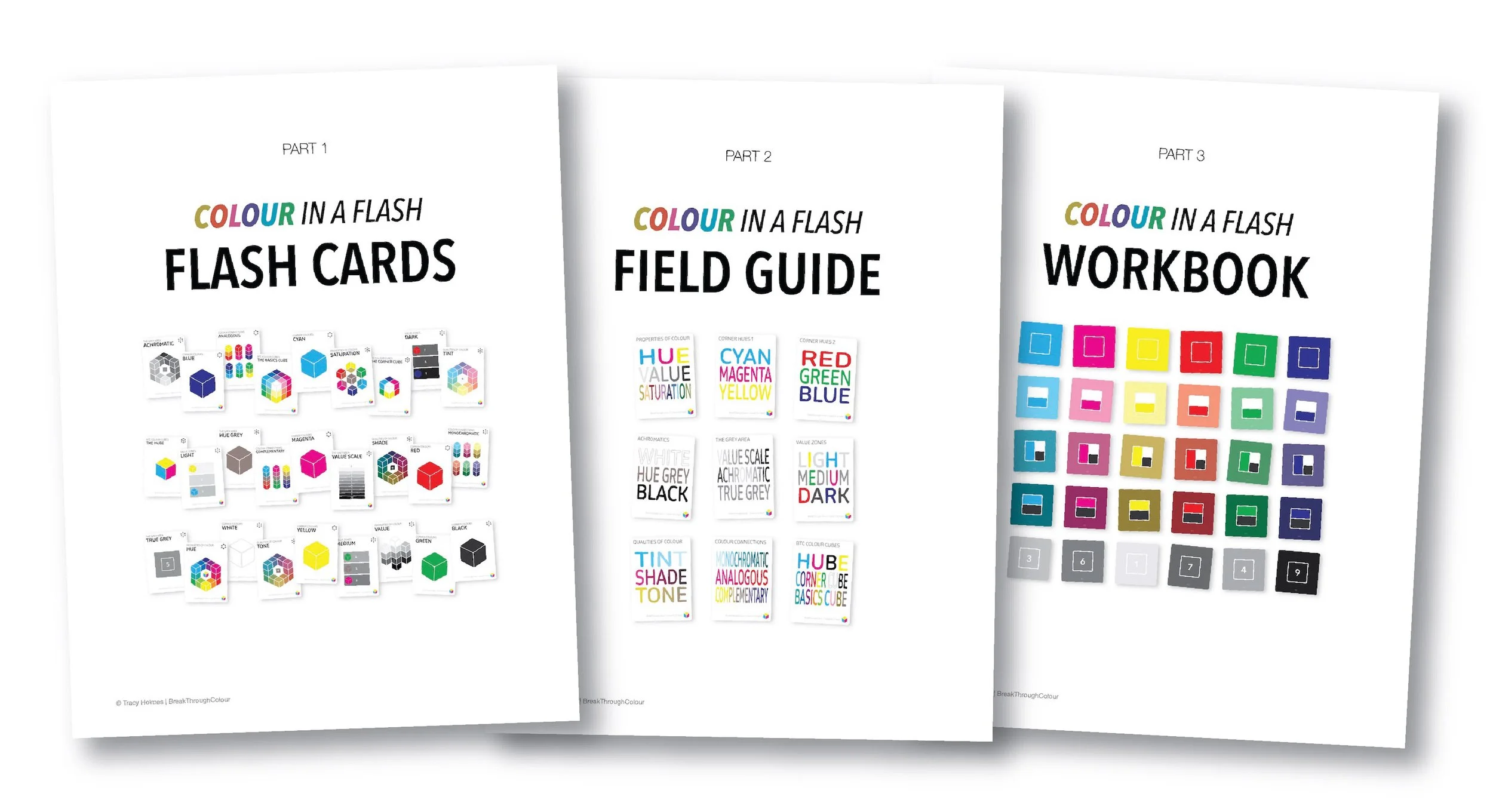
There’s also a 3-part WorkBook that includes a visual Glossary, pages to make your own Field Guide Field Notes, and Swatch Sheets to document your colour collection.
Designed to give artists, art teachers, homeschoolers, and other colour keeners a new foundation for defining and discussing colour, Colour In A Flash will flash you forward with clarity and confidence.
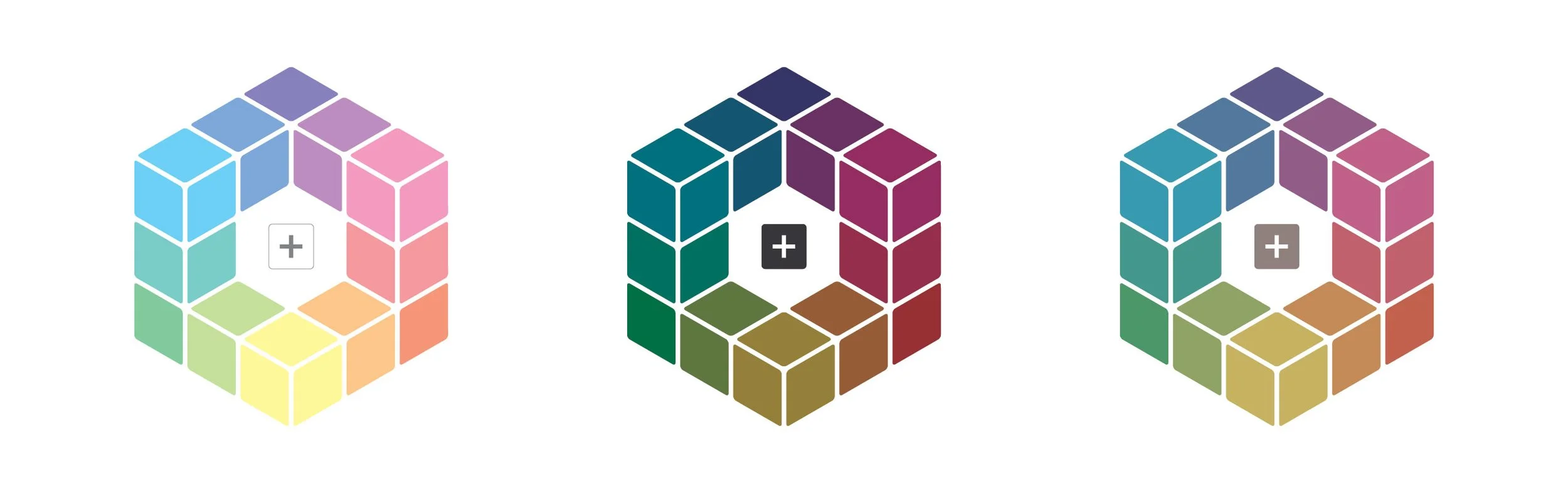
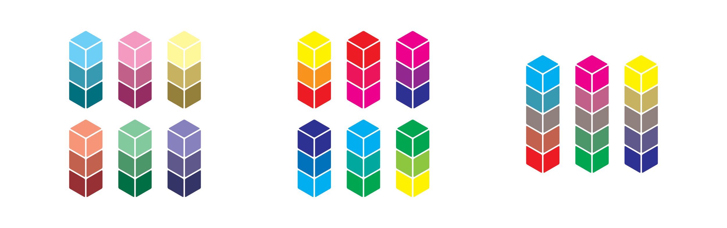
Here’s a closer look at the 27 colours and concepts that are featured in the free Colour In A Flash preview PDF, sorted into nine power-full sets of three…

CORNER HUES 1
The most fundamental set of three is Cyan, Magenta, and Yellow, modern Primary Colours for a modern colour practice.
I know, this is not what traditional colour theory teaches. But seeing is believing. And if you don’t believe seeing, believe science.
So why CMY and not RYB? Because thanks to science, we know better. Start with these new primaries and you’ll get a colour wheel that’s sure to become your new circle of best friends. You can still play in the mud… you’ll just get there by choice, instead of by mistake.
P.S. your Purples will thank you.

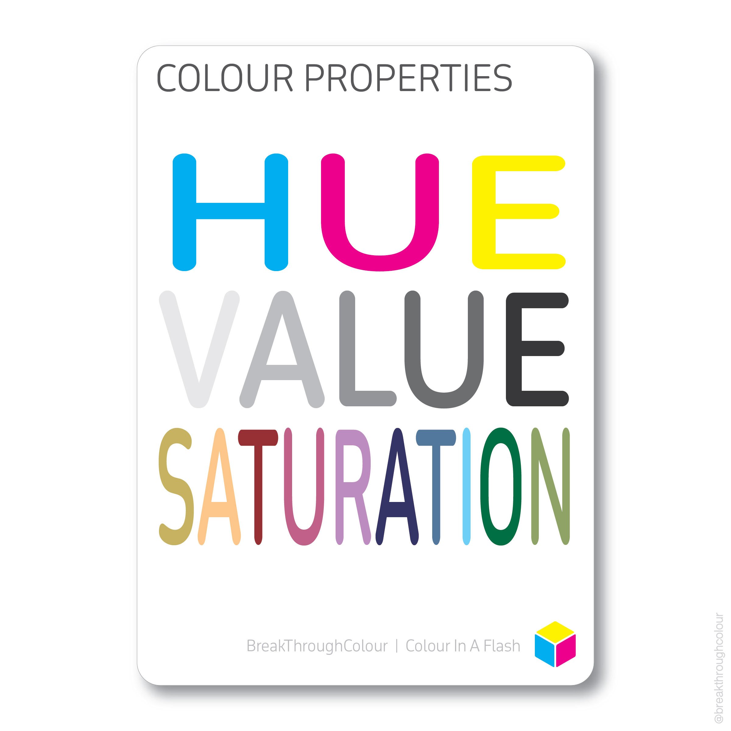
COLOUR PROPERTIES
Hue, Value, and Saturation are the three key Properties we can use to decipher and define any colour we come across.
Here are the questions:
What colour is it?
How light or dark is it?
How pure is it?
Understand these Properties of Colour, and you’ll always have the answers.

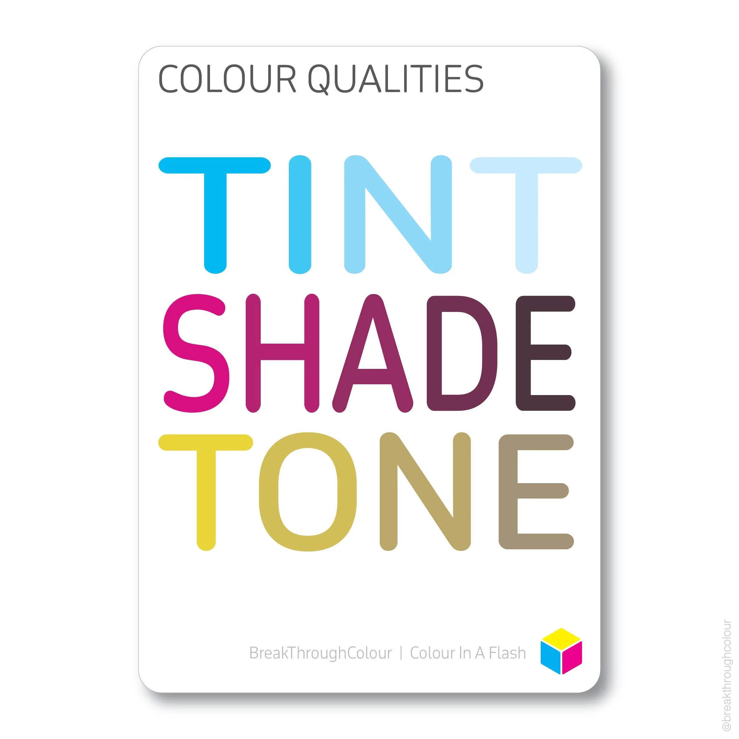
COLOUR QUALITIES
Tints, Shades, and Tones are the three different ways the Quality of a pure Hue can be faded, shaded, or desaturated to become same-but-different versions of its true Hue self.
Adding White makes a Hue lighter (but so does removing some of the Hue…).
Adding Black makes a Hue darker (but it’s what’s missing in the Hue in the first place that adds up to Black).
And adding both White and Black at the same time puts Hue in the Tone zone (and there are more Tones than Hues, Tints, and Shades combined… it’s a big zone!)
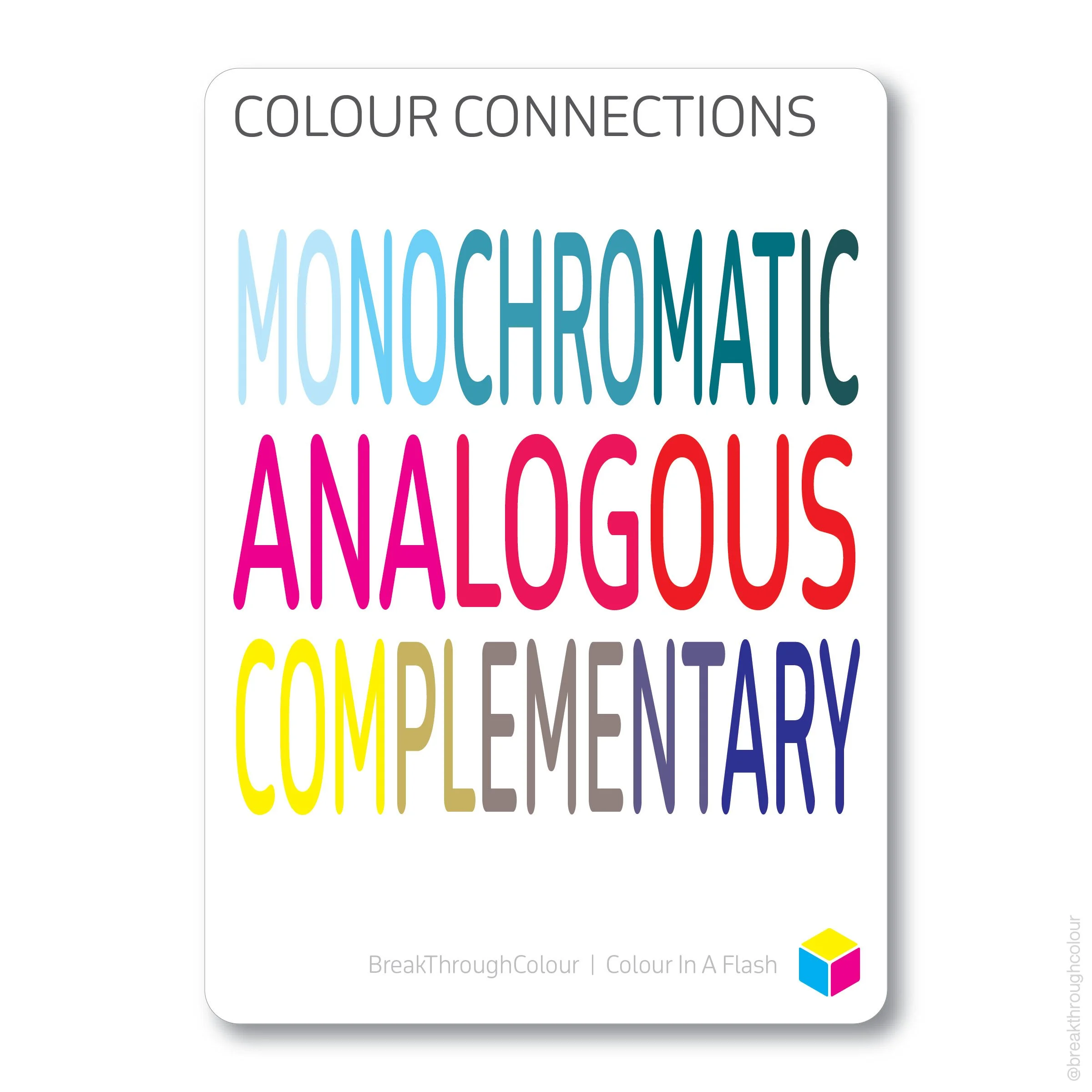
COLOUR CONNECTIONS
When it comes to making Connections, there are three familiar ways that colours can work and play well with other colours in 1-, 2-, or 3-dimensional colour palettes. Traditional colour theory calls these Monochromatic, Analogous, and Complementary.
Once you know your way around the 3D colour space, you’ll see how easy it is to make these fundamental colour connections and explore them on their own, without the confines of a colour wheel.
And the best way to create personal palettes is to learn the rules… and then break ‘em!
Even if you’re new to colour, these concepts may not be new to you.
But they’re not even half the story told in Colour In A Flash. It’s the other half that might surprise you…
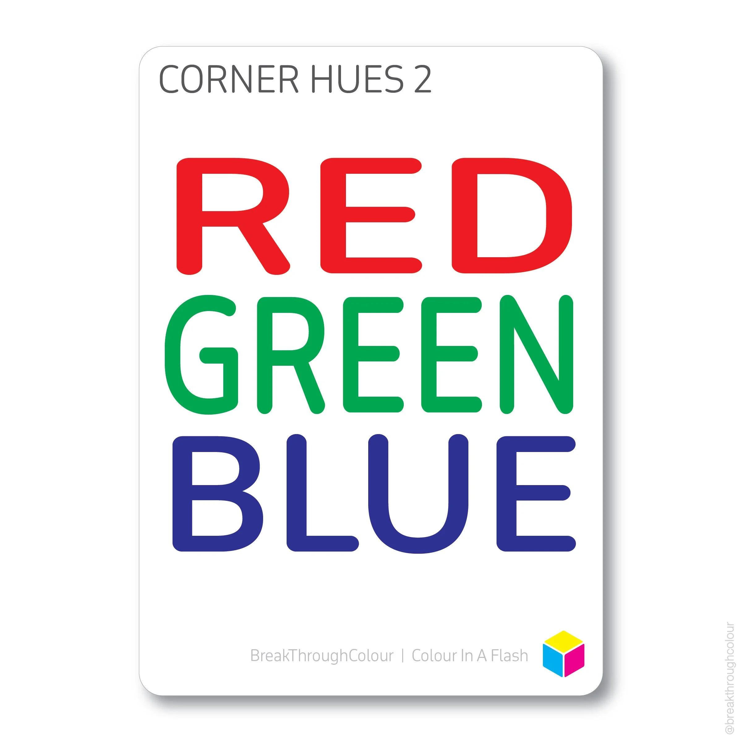
CORNER HUES 2
Did you know that Red is no longer considered a Primary Hue, and the same is true for ‘primary’ Blue?
Red is a ‘double scoop’ mix of Magenta and Yellow. Blue is the mix of Magenta and Cyan. And Green? It’s the in-between of Cyan and Yellow.
When R, G, and B fit in between C, M, and Y, not only do we have a full spectrum of Hues to work and play with, their new places in the colour space re-define the relationships between them, and mixing becomes more math-a-magical.
It also makes a better yin to the yang of the digital colour space, where RGB comes first and CMY follows. Learn one, and you learn the other.
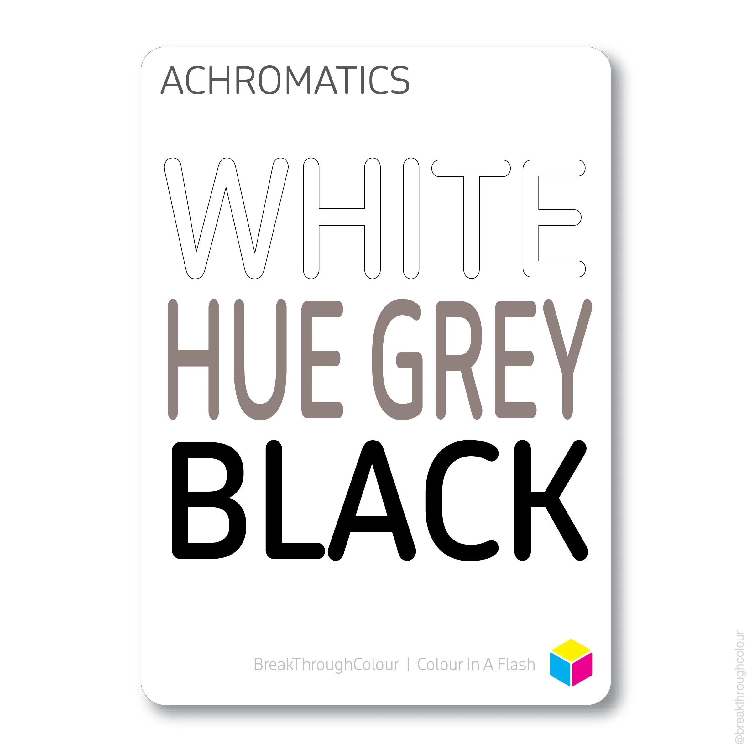
ACHROMATICS
It’s easy to tell the difference between the nothing of White and the everything of Black. In a CMY colour space, one is literally nothing, and the other is as colour-full as a colour can be.
But do you know the difference between Hue Grey and True Grey? They’re both in the middle of the mix, but one is an actual middle mix of Hues, and the other is totally hueless.
Knowing the difference is Value-able.

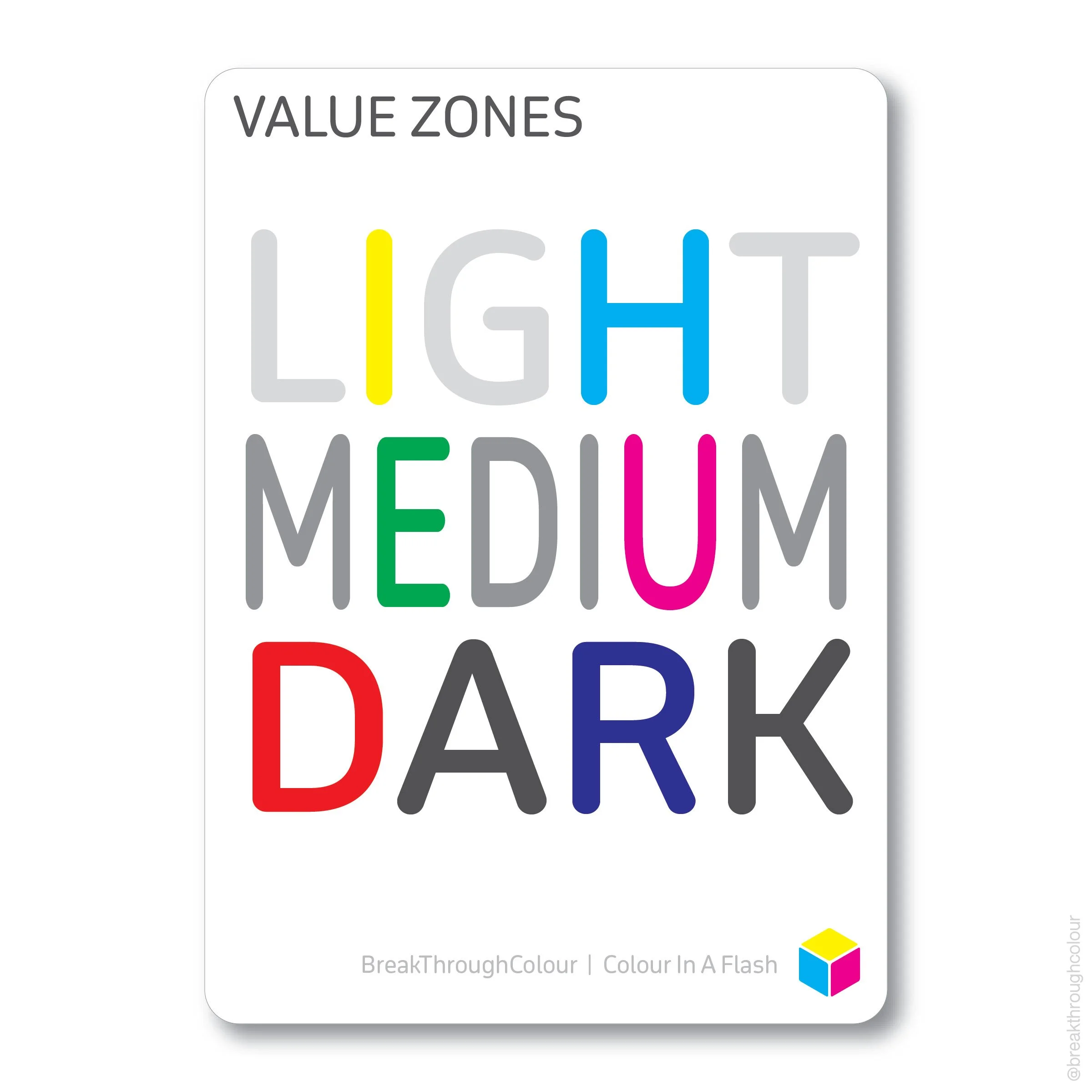
VALUE ZONES
You may know that Tints tend to be Light and Shades skew Dark. Does that mean pure Hues are Medium? They seem like ‘equals’ according to how they get evenly spaced on the spokes of a traditional colour wheel. But when Hues are hueless, you can clearly see, they’re not all the same. At all.
Each Hue has its own note on the Value Scale, even before it’s tinted lighter with White or shaded darker with Black.
Yellow is lightest, right next to White. Blue is the opposite, right beside Black. The other Corner Hues are in other places, and they do their part to balance the Value Scale full spectrum. Two Light, two Medium, two Dark.

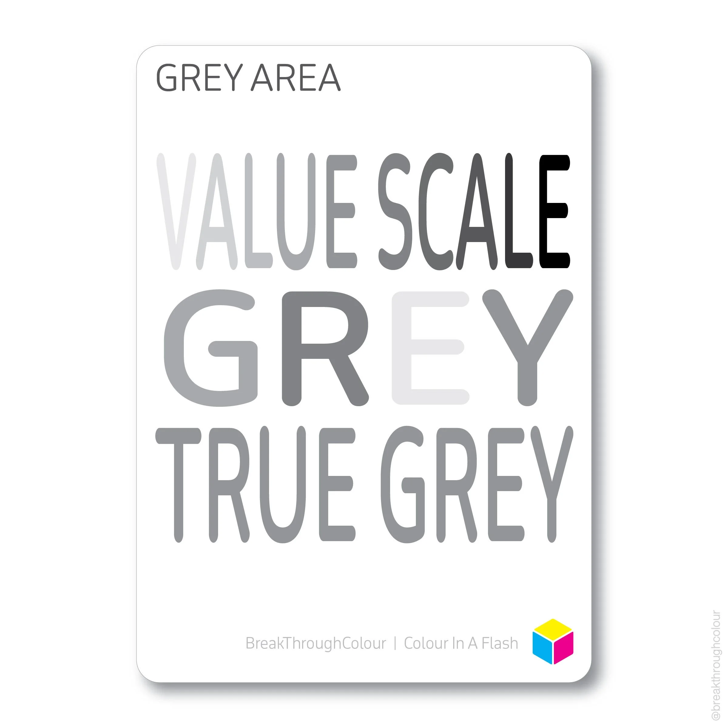
GREY AREA
The traditional concept of complementary colours teaches us that every colour can be matched with one (and only one) opposite colour. What one colour is, its opposite isn’t.
And, thanks to the value of Value, not only are opposite colours opposite in colour, they are also opposite in black & white. Pair them as Greys and they’ll add up to Black (just like they do in Hue).
The only colour without an opposite is the one and only colour that sits by itself at the centre of the Value Scale, the fulcrum of every complementary colour pair.
If bright colours make you feel Hue-phoric, True Grey may seem dull and dreary. But really, it’s the centre of everything, everywhere, all at once.

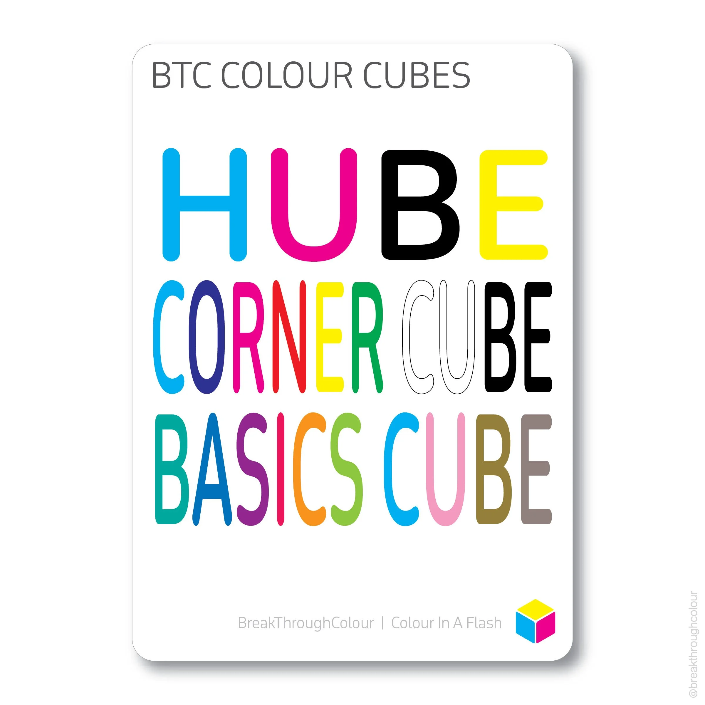
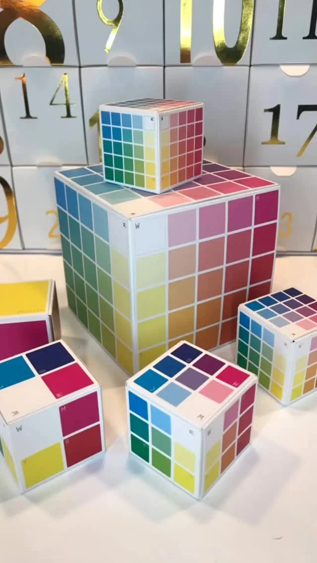
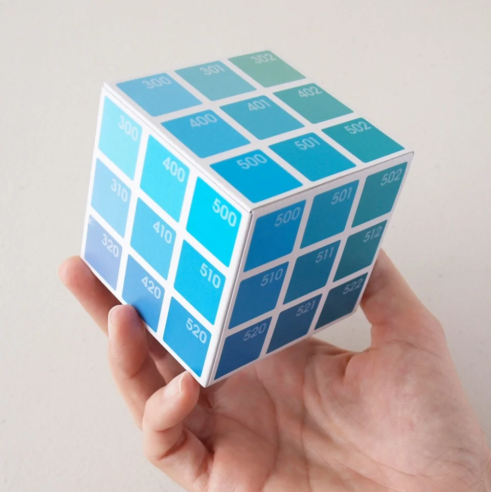
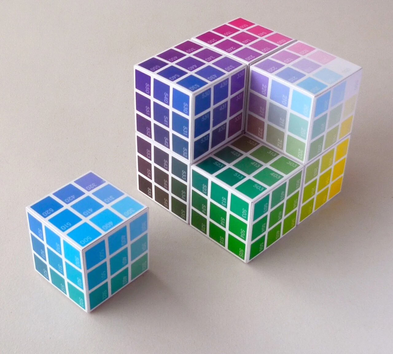
BREAKTHROUGHCOLOUR COLOUR CUBES
The Colour In A Flash collection ends with first looks at BreakThroughColour’s biggest breakthrough: Colour Cubes.
And this end is really the beginning. When you trade in your wheel for colour in 3D, BTC Colour Cubes are your GPS for CMY.
There are three different Colour Cubes to get you started. The Hube is a mini but mighty cube that gives Hue a new face, and it can spin through colour concepts as easily as any wheel. The Corner Cube adds White and Black to the pack, extreme opposites that unlock unlimited palette possibilities. And The Basics Cube gives BreakThroughColour its edge, as Corners make room for Connectors, and this Cube becomes your portal for Tints, Shades, and Tones. After that? Colour becomes exponential…
re-invent YOUR colour wheel!
Confused by colour? Who wouldn’t be? The traditional colour wheel has been rolling wonky for centuries!
Frustrated by mixing myths that promise one thing in theory, but don’t play out in practice? What’s up with that? Misguided methodology isn’t just a waste of time, it’s a waste of precious art supplies.
Uninspired by the ‘same old same old’ resources around you? I’m not surprised. Even when you adjust your starting points, a wheel can only take you so far…
If you’re ready for a fun, fast, and foolproof way to break through the misconceptions of traditional theory and get your hands on some cool new colour tools, then you’re ready for BreakThroughColour.
The breakthrough starts with Colour In A Flash. But once you’re familiar with these foundational concepts, oh the places you’ll go…
beyond the basics…
There are 400 different Hues, Tints, Shades, Tones, and Greys waiting for you to explore inside the BreakThroughColour system. With Code Tiles, Colour Cards, and Colour Cubes for every single one of them, I guarantee you’ll break through colour, and I can’t wait to guide you every step of the way.
Even if you’re colour confident, you may be stuck in a colour comfort zone. Ready to venture off and explore new places in the colour space?
Let me be your guide… colour breakthroughs guaranteed!
YOU’LL FIT RIGHT IN!
I spent most of my life almost understanding what ‘colour theory’ was and how it worked. But the problem with the traditional colour wheel was (and still is), it almost works. And that’s almost worse, because when something is so widely used and accepted as a system that fully works, the parts that don’t leave us feeling like it’s our fault.
I created BreakThroughColour because I wanted a way to make sense of something that I always believed could and should be not just understandable, but accessible, easy and fun for everyone, not just artists, or designers, or teachers. Everyone.
I came up with something that worked for me, and once I started sharing it was others, I realized I wasn't the only one ready for something better.
How about you? Are you ready to join me in a new colour space? There’s room for you to break through too. I promise.
LET’S STAY IN TOUCH!
Subscribing to my list and becoming a member of my colour-full community is the best way to stay in touch with news, special invites, offers, and other stuff I don’t share anywhere else.
Scroll back up to the top of this page to download your Colour In A Flash freebie.
That will get you on my mailing list, and I’ll keep you posted about other resources to help you establish and nurture your personal colour practice. Of course, you can Unsubscribe at any time, but who doesn’t want a little colour in their In Box?
You can also visit me on Instagram where I share images, graphics, reels, and other resources related to All Things Colour. It’s not just eye candy, there’s plenty of content in the captions, so be sure to explore there as well. And if you’re on IG, let me know, so I can check out your colourful journey.
Here’s a peek at my latest posts…